
Today, I'm thrilled to introduce you to the refreshed ThinLinc brand. This revitalization perfectly matches our software's growing global reach. It's the ideal time to highlight ThinLinc's spirit of innovation through our brand more strongly.
![]()
Our new design seamlessly incorporates elements from the Cendio logo, strengthening ThinLinc's identity and enriching our communication. You will witness this transition gradually across all our touchpoints.

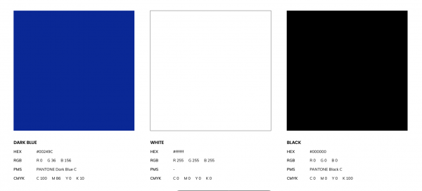
The renewed ThinLinc brand now features a lighter blue shade, an homage to our Swedish roots. Our brand's logo and typography have been designed meticulously by the talented Germano Hentges Redecker.
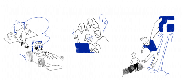
Furthermore, Germano led the creative direction of a unique pattern and a series of playful and intriguing illustrations, all skillfully brought to life by the artist Luiza Oliveira. The combination of Germano's leadership and Luiza's artistic execution lends our brand a unique touch, achieving a balance between technical innovation and artistic expression.

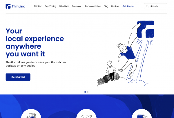
Additionally, Germano was instrumental in designing our refreshed website, adhering to the new brand guidelines. The Bravo team proficiently executed this design, resulting in the launch of a website today that mirrors the brand's rejuvenated energy and offers an improved user experience.
I'd like to acknowledge the immeasurable contributions of our internal team, whose unwavering efforts in reviewing and refining the infrastructure ensured the website's smooth launch.
As CMO, I interpret the new logo, the unique pattern, and the engaging illustrations as a potent representation of the connection between users and technology. They embody ThinLinc's role as a reliable conduit between users and technology, facilitating intuitive connections that integrate technology seamlessly into everyday life.
Our central vision hinges on the concept of remote accessibility – enabling users to access their Linux desktops and applications from anywhere, while delivering an experience that feels as immediate and responsive as being locally connected, using their device of choice.
This transformative phase holds profound significance for us, reflecting our steadfast commitment to fostering creativity and innovation – values that are now artistically embedded in our new brand.
Redecker shared his creative journey throughout the project: "The technical logo redesign for ThinLinc aimed to visually align the brand with its key features and bring it up-to-date. The new icon, inspired by geometric shapes and modernism, symbolizes ThinLinc's reliable connection for its users, regardless of their location or device. The refreshed typography maintains aspects of the original, yet modernizes it to reflect the icon's aesthetic in the logotype. A vibrant color palette infuses the ThinLinc logo with renewed vitality, honoring its past while preparing for future challenges."
As we prepare for the upcoming updates to the ThinLinc software, I'm delighted to invite you to explore all facets of our revitalized brand, our new website, and our charming illustrations. Please join us in celebrating this exciting chapter for ThinLinc and Cendio, and stay connected for more exciting news and updates!
Jean Zagonel
Chief Marketing Officer at Cendio